These are the real Figma prototypes, embedded live, so they need a stable connection and can still feel slow or skip a step. For the full picture, open the Figma file. Every screen, state, the design system and the components are there.
01Overview
A league that looked finished, rebuilt so it could ship.
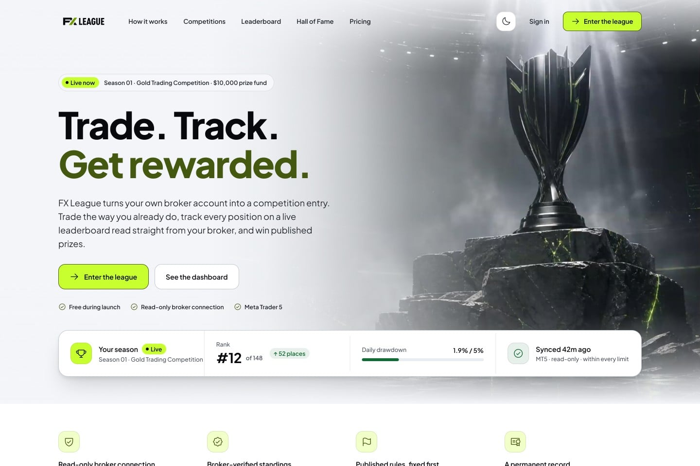
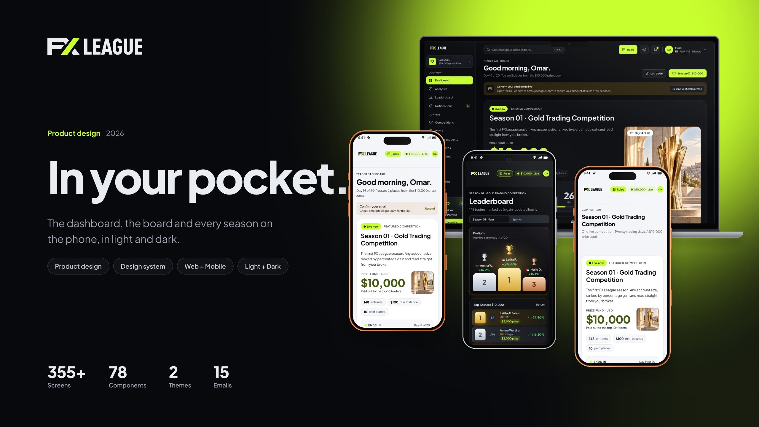
FX League runs seasonal forex trading competitions. Traders connect a broker account, compete on percentage gain under risk rules and climb a live leaderboard toward a prize pool. The first version was designed by someone else and was mostly captured web pages. I took it from there and rebuilt it as one system covering web, mobile and email, in light and dark.
02The problem
A file that looked finished but couldn’t be built from.
Before designing anything I measured every layer in the file, so the plan rested on findings, not opinion. Onboarding, broker connection, the host side and every empty and error state were missing entirely.
3.4%of 8,605 text layers used a text style
174different solid colours in use
0component instances on any screen
5 of 65screens had a dark theme
03Who it’s for
Three audiences, one product.
Each side of the league needed its own space, but all of them had to feel like the same product and share the same parts.
Traders
Join a season, connect a broker account, see rank and rule limits at a glance, log trades and claim prizes.
Admins and hosts
Create competitions in a guided wizard, review entries and rule breaches, then release prizes.
Affiliates
Share tracking links, follow referred traders and export results for payouts.
04How it came together
Scan, foundations, library, then screens.
Each phase had an exit rule, so nothing moved forward on hardcoded values. Every screen was checked for overlaps, clipped text, unbound fills and contrast in both themes before the next one started.
01
Scan
Measured every layer, font, colour and effect
→
02
Foundations
Colour, type, spacing, radius and elevation, light and dark
→
03
Components
78 components and variant sets with states
→
04
Screens
Rebuilt line by line, then three client review rounds
05Key decisions
The calls that shaped it.
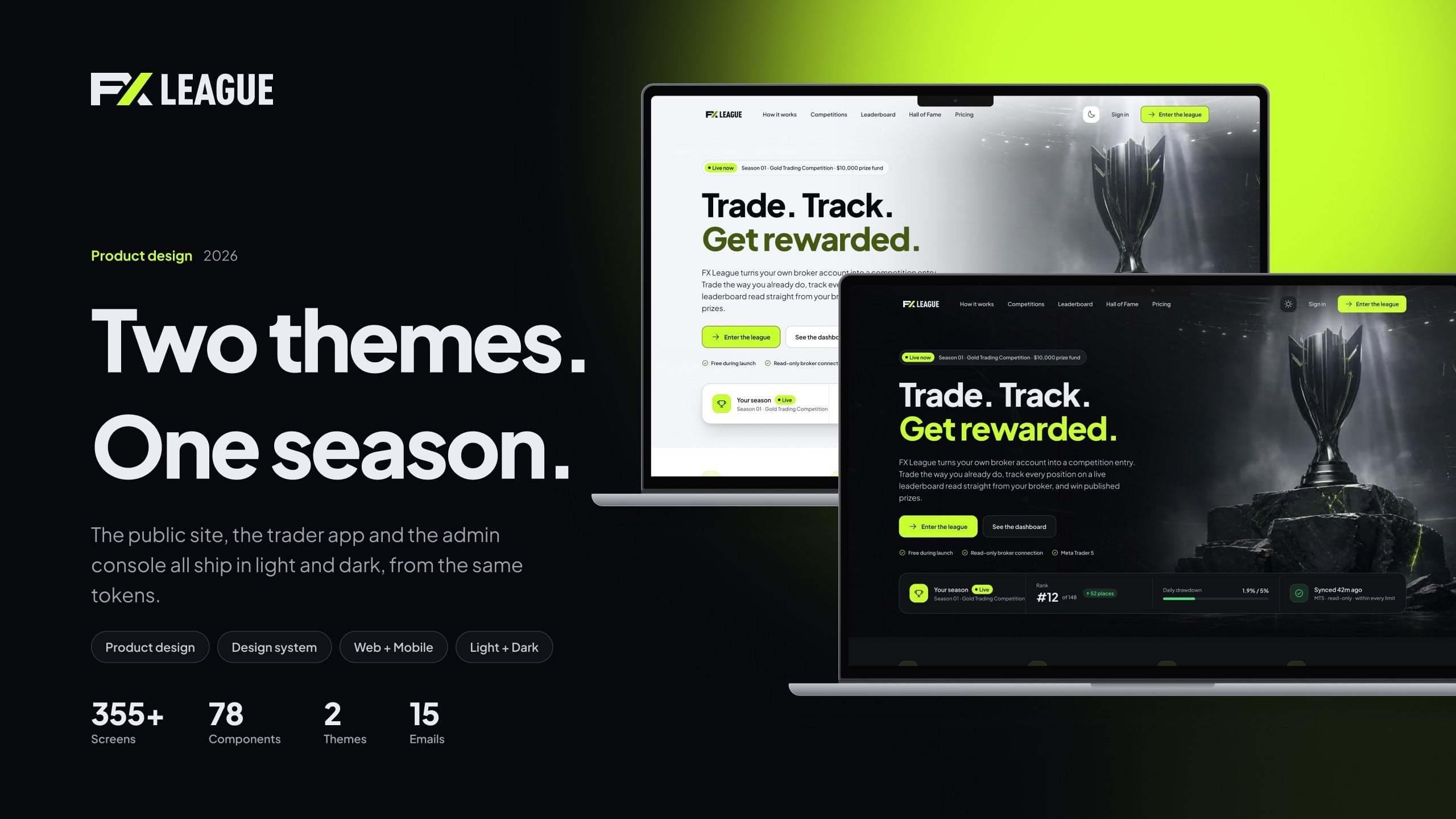
Light and dark
The problem
Only 5 of 65 screens had a dark theme, and each one was a separate, hand-made copy.
The fix
38 semantic tokens with Light and Dark modes. A screen switches theme by changing one mode on its frame.
Core decisions
Dark is never a copy, so both themes stay in sync.
Contrast checked in both modes: 4.5:1 for text, 3:1 for icons, rails and chart lines.
The same frames carried through all three review rounds.
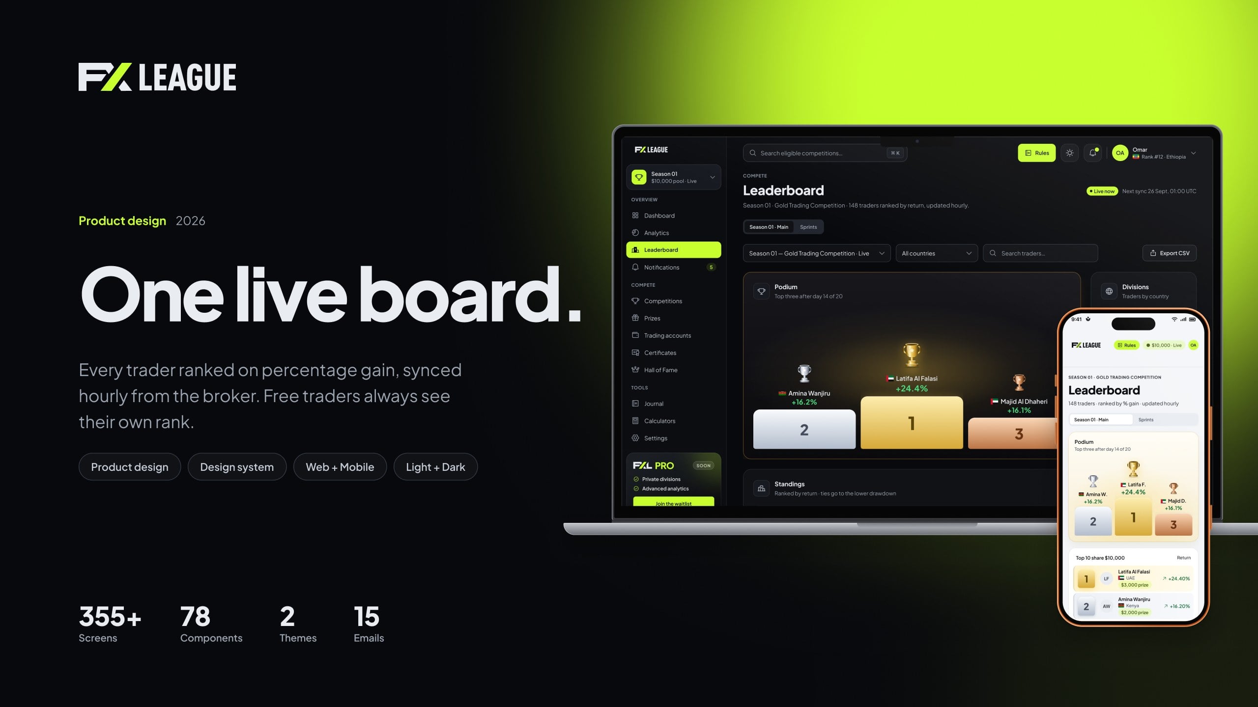
Leaderboard
The problem
Traders need to know where they stand in a second, not after scrolling a table.
The fix
A podium for the top three, then dense rows with tabular figures, your own row pinned and rule status beside every name.
Core decisions
The live season leads every trader screen: prize fund, countdown and the next action.
One competition card covers live, upcoming, ended and sprint formats.
Empty and failure states are real screens, from broker server not found to a rule breach.
06In numbers
From captures to a system the team can build on.
49screens, each in light and dark
32mobile layouts at 390
78components and variant sets
8transactional emails
07What I learned
What I’d keep doing.
Measure before you redesign
The scan turned a vague sense of mess into numbers the client could agree with.
Modes beat copies
One set of frames to maintain, and both themes stayed in sync.
Design the failure path early
Empty and error states surfaced missing product decisions before development.
The system underneath
Figma variables for semantic colour in light and dark modes, plus the type scale and the components behind the web and mobile apps.